Büro 247 is a graphic design studio based in Berlin. Our approach blends conceptual rigour, creativity and craftsmanship.
Büro 247 was founded by Craig Sinnamon. Our output spans print, digital media and physical space for cultural and commercial clients — often developing into long-term working relationships. We regularly form (or join) project-specific teams from a network of specialists. We are always open to new connections, clients and collaborators.
Get in touch using electronic mail.
Büro 247
Mainzer Straße 54
12053 Berlin, Deutschland
mail@buero247.net
Books
Creative direction
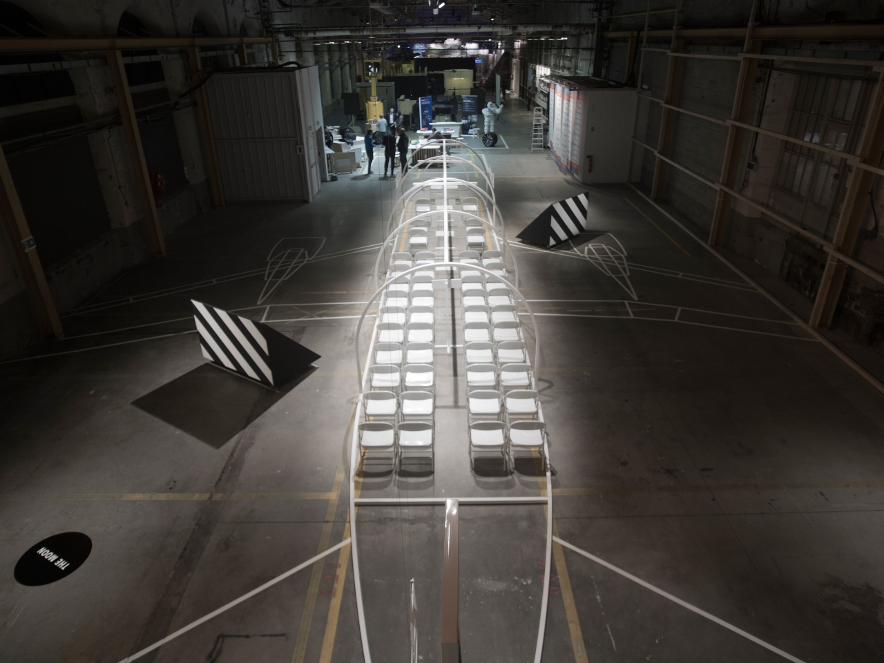
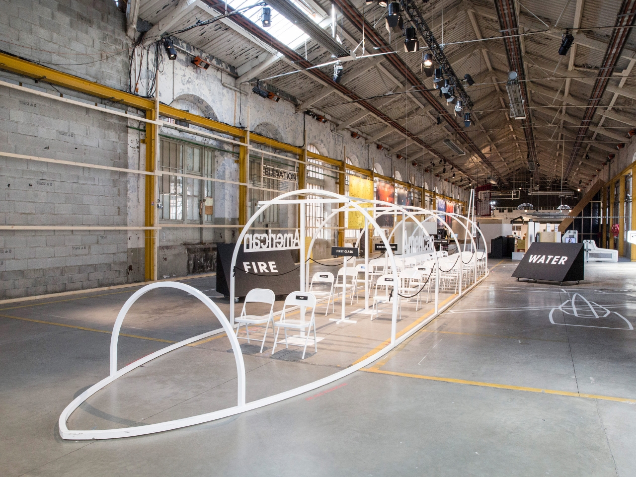
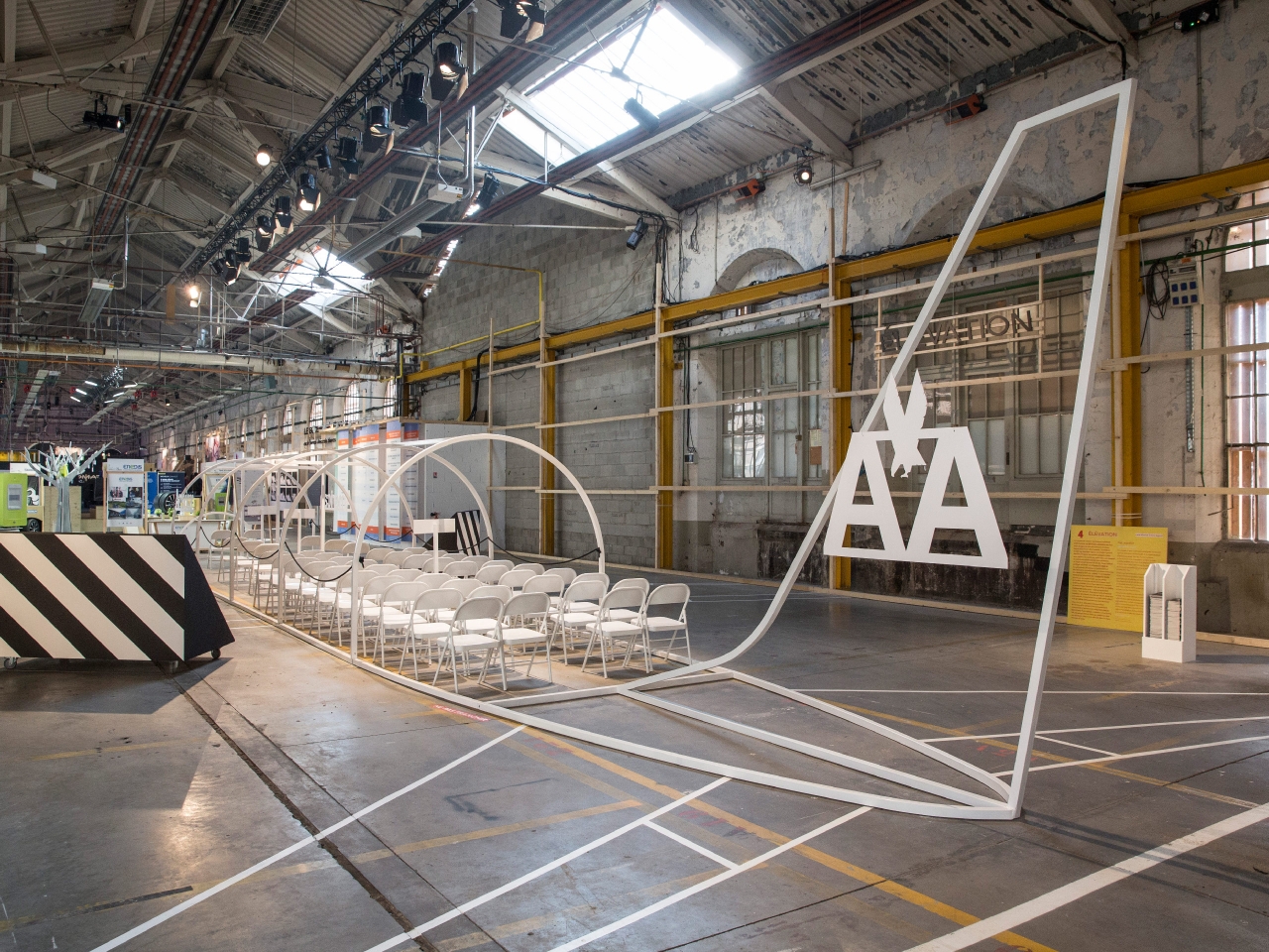
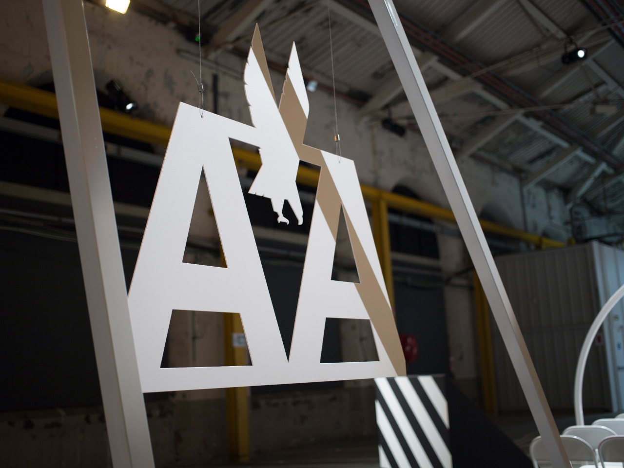
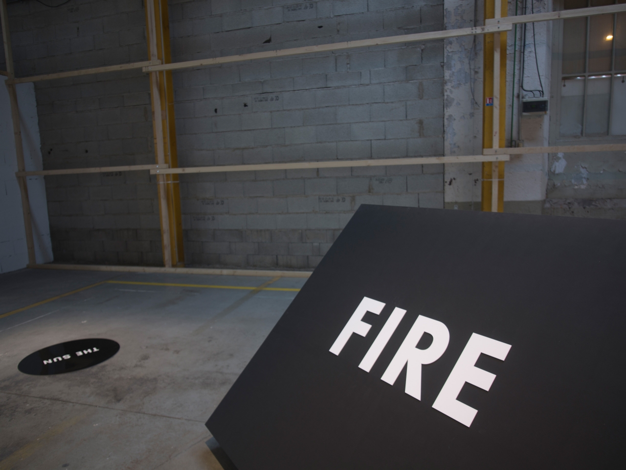
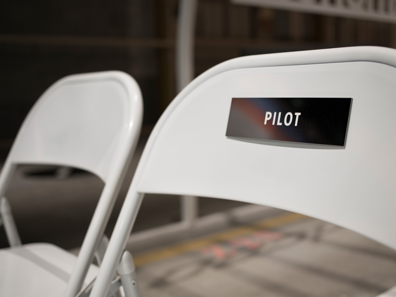
Exhibitions
Identity design
Packaging
Printed matter
Publications
Research
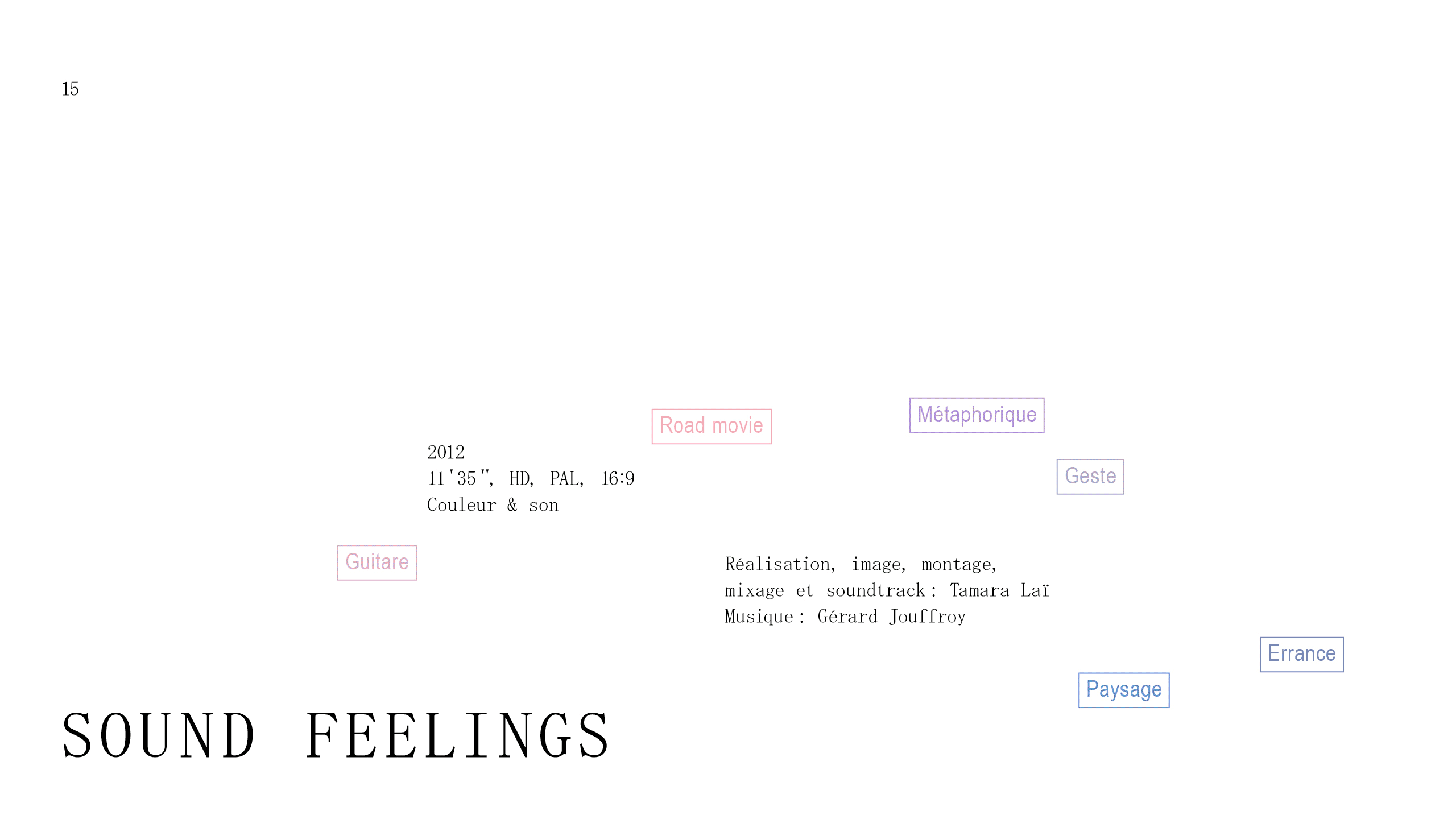
Signage
Strategy
Typography
Websites
Argo Books
Atelier Paulina Piipponen
Belmacz Gallery
Design Research Studio
Gernot Wieland
Historic England
Illuminated River Foundation
Ilona Gaynor
Kunst Halle Sankt Gallen
Léon Wuidar
London Institute of Photography
Moving Brands
Musée des Arts Contemporains Grand-Hornu
Playlab
Salzburger Kunstverein
Somerset House
Tom Dixon
V2 Institute for Unstable Media
The work of Craig Sinnamon and the studio has been published internationally in books, journals and magazines including Grafik (UK), Slanted (DE), Étapes (FR), Perspecta (US) and Idea (JP). Craig has lectured at Central Saint Martins (UK), Nottingham Trent University (UK), Hochschule München (DE) and Hochschule Düsseldorf PBSA (DE). He has run design workshops at Sofia Design Week (BG) and 20plusX München (DE).
Craig’s work with the artist Ilona Gaynor has been exhibited at the Design Museum (UK), V2 Institute of Unstable Media (NL), Biennale Internationale Design Saint-Étienne (FR) and Université de Montréal (CA). The studio’s work forms part of the permanent collection of Irish design at 100 Archive. Büro 247 does not enter awards.
We are not offering an internship at present. We are happy to receive portfolios and appreciate your interest in the studio. Unfortunately we cannot respond to every application and request.
Web development: Virgile Janssen
Typeface: Pitch Sans Mono
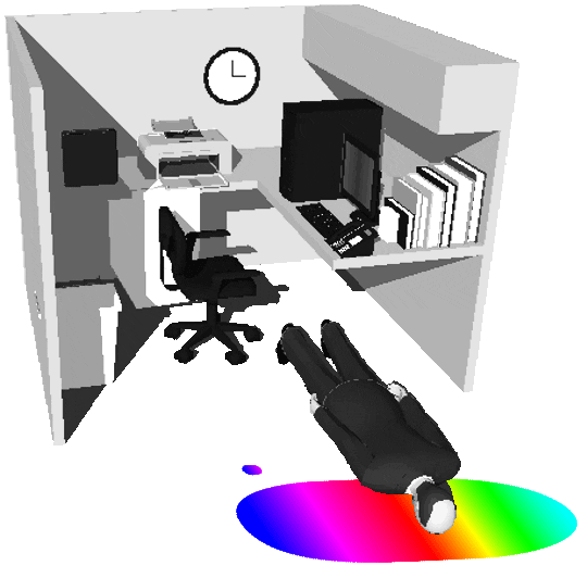
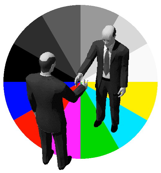
Businessman animations: Alec Mackenzie
Unless otherwise indicated, all materials on these pages are copyrighted. No part of these pages, either text or images may be used for any purpose other than personal use, unless explicit authorisation is given by Büro 247. Therefore reproduction, modification, storage in a retrieval system or retransmission, in any form or by any means — electronic, mechanical or otherwise — for reasons other than personal use, is strictly prohibited without prior written permission.
Büro 247 is committed to protecting and respecting the privacy of our clients and collaborators. For the sake of brevity, users of this website can rest assured that any basic data collected by this website is either essential, generic and in full accordance to EU General Data Protection Regulation.
Büro 247 is owned and operated by Craig Sinnamon.
USt-ID (VAT) Nr: DE342 621 446
© 2024 / All rights reserved
Büro 247 is a graphic design studio based in Berlin.